Get a Forecast and Plot the Next Hour of Rain
Call the forecast endpoint for any location, then chart its minute-by-minute nowcast to see exactly when rain starts and stops.
Oct 9, 2026 · Python
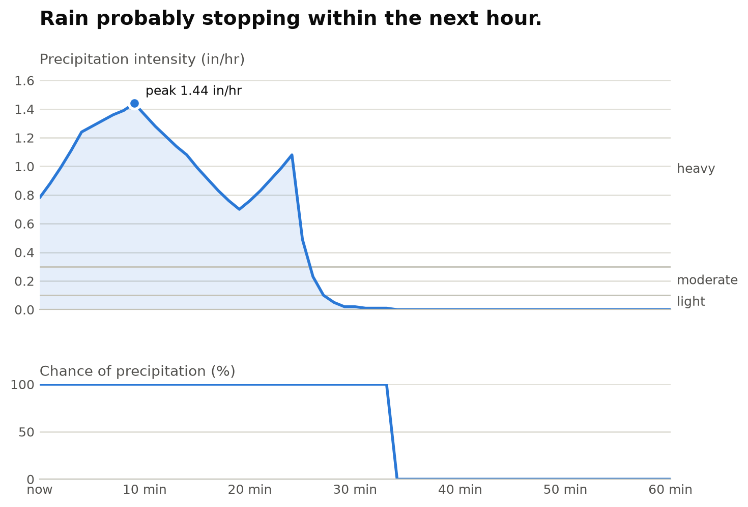
The /forecast endpoint returns everything an app needs for one location in a single call: current conditions, an hourly and daily forecast, and severe weather alerts. It also returns a nowcast: precipitation for each of the next 60 minutes, so you can tell people not just whether it will rain, but when it starts, how hard it gets and when it stops.
This tutorial requests a forecast, reads the nowcast and plots it.
You'll need a MyRadar API key and Python 3 with requests and matplotlib (pip install requests matplotlib).
1. Request a forecast#
The location goes in the path as latitude,longitude. Send your key in the Subscription-Key header:
import requests

MYRADAR_API_KEY = "YOUR_KEY"
headers = {"Subscription-Key": MYRADAR_API_KEY}

latitude, longitude = 42.04, -92.9  # Marshalltown, Iowa
url = f"https://api.myradar.dev/v1/forecast/{latitude},{longitude}"

response = requests.get(url, headers=headers, params={"units": "us"})
response.raise_for_status()
forecast = response.json()
The endpoint takes a few optional settings as query parameters:
| Parameter | Values | What it does |
|---|---|---|
units | us (default), si, ca, uk2 | Units for every value. With us, precipitation intensity is in inches per hour; with si, millimeters per hour. |
extend | hourly | Return 168 hours of hourly forecast instead of 48. |
exclude | comma-separated section names | Leave sections out of the response, e.g. hourly,daily. |
lang | en | Language of the text summaries. |
This tutorial sets units=us explicitly, because the plot's rain-rate thresholds are in inches per hour. A 401 or 403 means the key is missing or invalid, and 429 means you've hit your plan's rate limit.
2. Read the nowcast#
The response has one section per time scale: currently, minutely, hourly and daily, plus alerts when any are active. The nowcast is minutely: a one-line summary and a data list with one entry per minute.
now = forecast["currently"]
print("Now:", now["summary"], f'{now["temperature"]:.0f}°F')

minutely = forecast.get("minutely")
if minutely is None:
    raise SystemExit("No nowcast here: minutely data covers the US only.")

print(minutely["summary"])
for minute in minutely["data"][:10:3]:
    print(minute["time"], minute["precipIntensity"], minute["precipProbability"])
For the thunderstorm forecast in the chart above, that prints:
Now: Thunderstorms. 57°F
Rain probably stopping within the next hour.
1791538560 0.78 1
1791538740 1.11 1
1791538920 1.32 1
1791539100 1.44 1
Each minute has:
| Field | Meaning |
|---|---|
time | UNIX time, aligned to the start of the minute. |
precipIntensity | Precipitation rate (inches per hour with units=us). |
precipProbability | Chance of precipitation, from 0 to 1. |
precipType | rain, snow or sleet, when precipitation is expected. |
The nowcast covers the United States. Elsewhere, minutely is left out of the response, so check for it before using it, as the code above does.
3. Plot the next hour#
Plot intensity over the next 60 minutes, with the National Weather Service's rain-rate categories marked so the numbers mean something at a glance: light is under 0.10 in/hr, moderate up to 0.30, and heavy above that. The chance of precipitation is a different measure, so it gets its own small chart underneath rather than a second scale on the same one.
import matplotlib.pyplot as plt

BLUE, INK, SECONDARY, GRID, RULE = "#2a78d6", "#0b0b0b", "#52514e", "#e1e0d9", "#c3c2b7"

def plot_nowcast(forecast, filename="nowcast.png"):
    points = forecast["minutely"]["data"]
    start = points[0]["time"]
    minutes = [(p["time"] - start) / 60 for p in points]
    intensity = [p["precipIntensity"] for p in points]
    chance = [p["precipProbability"] * 100 for p in points]

    fig, (top, bottom) = plt.subplots(
        2, 1, figsize=(8, 5.2), sharex=True,
        gridspec_kw={"height_ratios": [3, 1.2], "hspace": 0.45},
    )
    top.text(0, 1.2, forecast["minutely"]["summary"], transform=top.transAxes,
             fontsize=14, fontweight="bold", color=INK)

    # Intensity: one series, a 2px line over a light wash
    top.fill_between(minutes, intensity, color=BLUE, alpha=0.12, linewidth=0)
    top.plot(minutes, intensity, color=BLUE, linewidth=2, solid_capstyle="round")
    top.set_title("Precipitation intensity (in/hr)", loc="left", fontsize=10, color=SECONDARY)
    ceiling = max(0.4, max(intensity) * 1.15)
    top.set_ylim(0, ceiling)

    # NWS rain-rate categories: light < 0.10, moderate 0.10-0.30, heavy > 0.30 in/hr
    for level in (0.10, 0.30):
        top.axhline(level, color=RULE, linewidth=1, zorder=1)
    for low, high, label in [(0, 0.10, "light"), (0.10, 0.30, "moderate"), (0.30, ceiling, "heavy")]:
        top.text(60.6, (low + high) / 2, label, va="center", fontsize=9, color=SECONDARY)

    peak = max(range(len(points)), key=lambda i: intensity[i])
    if intensity[peak] > 0:
        top.plot(minutes[peak], intensity[peak], "o", markersize=8, color=BLUE,
                 markeredgecolor="white", markeredgewidth=2)
        top.annotate(f"peak {intensity[peak]:.2f} in/hr", (minutes[peak], intensity[peak]),
                     xytext=(8, 6), textcoords="offset points", fontsize=9, color=INK)

    # Chance of precipitation: its own small chart, never a second y-axis
    bottom.plot(minutes, chance, color=BLUE, linewidth=2, solid_capstyle="round")
    bottom.set_title("Chance of precipitation (%)", loc="left", fontsize=10, color=SECONDARY)
    bottom.set_ylim(0, 100)
    bottom.set_yticks([0, 50, 100])

    bottom.set_xlim(0, 60)
    bottom.set_xticks(range(0, 61, 10))
    bottom.set_xticklabels(["now"] + [f"{m} min" for m in range(10, 61, 10)])

    for ax in (top, bottom):
        ax.grid(axis="y", color=GRID, linewidth=1)
        ax.set_axisbelow(True)
        ax.tick_params(colors=SECONDARY, labelsize=9, length=0)
        for side in ("top", "right", "left"):
            ax.spines[side].set_visible(False)
        ax.spines["bottom"].set_color("#c3c2b7")

    fig.savefig(filename, dpi=200, bbox_inches="tight", facecolor="white")

plot_nowcast(forecast)
Run steps 1 to 3 as one script and it saves nowcast.png. The summary from the response becomes the chart's headline. If it isn't raining near your location, the chart is a flat line at zero; pick a location where radar shows rain to see it work.
4. Use the rest of the forecast#
The same response feeds the rest of a weather screen:
for hour in forecast["hourly"]["data"][:12]:
    print(hour["time"], hour["temperature"], hour["precipProbability"])

today = forecast["daily"]["data"][0]
print(today["summary"], today["temperatureHigh"], today["temperatureLow"])

for alert in forecast.get("alerts", []):
    print(alert["severity"], alert["title"])
If you only need the next hour, request less data with exclude:
params = {"units": "us", "exclude": "hourly,daily,alerts"}Next steps#
- Every field in the response is described in the forecast endpoint reference.
- For a forecast along a drive rather than at one point, see Get a route forecast and make a plot.